By Anthony Smith-Chaigneau, Sr. Director Product Marketing, NAGRA
For pay-TV operators, designing a user interface (UI) is a tricky task. A pay-TV service must meet often very particular criteria that satisfy a broad range of users. Consider the average household, for example – it’ll be inhabited by multiple generations, all with their own preferences. A good pay-TV UI must please all of them.
Now broadly speaking, there are three approaches to the user experience (UX) that a pay-TV operator can take: the menu, the app and the EPG.
Menus are straightforward navigation points to areas of interest – like VOD or a library of the user's own content. Menus are standard across all systems. App-based navigation meanwhile was popularised by Apple smartphones (and more recently Apple TV). The EPG, in contrast, is considered the traditional approach more closely linked to conventional linear broadcasting.
Putting the menu to one side (given they appear across all systems), the EPG and the app can be observed to create two different user journeys – the EPG creates what we term a traditional journey, while the app creates the modern journey. For a user on the traditional EPG journey, they follow this path: when they want to find something to watch, they use the associated remote button (grid guide, PVR, number keys etc.) to get there. The modern journey takes a different route: when the user wants to find something to watch, they go to the menu. From there, they can use a recommendation system within the app (discover, saved, live, search by genre and more).
Now, neither of these user experiences are perfect – they can’t satisfy everybody’s preferences in a completely frictionless way. The EPG tends to suit traditional users, while the app tends to suit modern users. Therefore, the key to satisfying that whole household of different users, and creating that frictionless experience, is to intersect these two journeys.
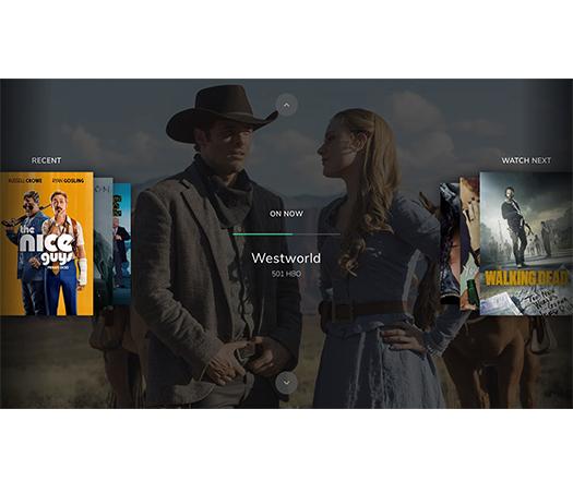
The intersection of modern and traditional can be best described as a timeline. This is based on the principle that the simplest journey is a straight line. In this sense, if we intersect both traditional and modern user journeys, the path becomes the straight line across past (your recently viewed content), present (what’s on now) and future (what to watch next). Within this timeline, the user of course also has the option to scroll between channels. We’re calling this approach EPG 2.0.
EPG 2.0 allows both the traditional journey (scrolling through channels via the EPG) and the modern journey (searching via recommendations) to take place without friction. As the term suggests, it’s important to stress that this solution is part of a continually evolving process. After all, UIs must be constantly growing and adapting to satisfy user habits. In the future for example, we may have moved away from GUIs altogether, and so the UI will need to adapt and change again.
The most important point here is not to propose a new model to be used indefinitely, but rather propose a new approach that places the user at the centre.